Watch this. I have no words. Oh except that it is genius to put your pants on without using your hands.
Wednesday, May 06, 2009
Response: Last Week of Classes
I can't believe it's here. The end.
Okay, so my family is ridiculously close, so of course they have seen my CountryHome.com prototype, all my Vox designs, my web site and now my mini portfolio even though they are all in Chicago. Today my dad sent me an email telling me how proud I should be of everything that I accomplished this year and how I exceeded all the expectations he had for my success at Mizzou (sweet, right?).
It made me feel really good, and I thought to myself: if everyone of my fellow Advanced Design students does have a person who will remind them of all they have accomplished, I will be that person. We should all be damn proud of making it through alive- hell, some of are coming out kicking and screaming. So, way to go us. Now, pat yourself on the back.
Critique: Week 14
This is it folks. My last week of undergrad. Wow.
Needless to say, I have been a designing fool this week. Finally got my web site up: KristinNoe.com. I'm pretty happy with it. It gives the exact tone that I wanted, I guess I just wish I had more really awesome, diverse work to put up.
After seeing how great Abbey's mini portfolio turned out, I used Blurb.com to make one also. I would have liked to have tried something handmade, but that just isn't in the cards for this time of the year. That being said, I really like how professional the Blurb books look. I can't wait to see it! Check out the preview here.
This past weekend I also got to art direct a photo shoot for the Books department of Vox. We were only shooting books, but I got to work with the photographer a lot, which was a very educational experience. He came up with some very interesting ways to arrange the books that made them look really beautiful. I guess that's why they pay him the... oh wait, no.
Oh, and the Pets issue comes out tomorrow! I was very happy with my feature on animal cruelty, but noticed in galley edits that some of my favorite parts of the spread were changed :( and I didn't save a copy of it, so I'll have to wait until tomorrow and get the pdf.
Sorry there is nothing visual to show for my week's work. Hopefully I'll pick up some interesting projects over the summer that I will be able to post!
Wednesday, April 29, 2009
Critique: Week 13
So close, yet so far away...
This week, I changed my focus from one web site project to another and worked like a dog to get a working web portfolio up. Unfortunately for me, figuring out how to host my own web site has proved to be more difficult than I ever thought it would be. I am now on my third redesign of the entire site and am finally starting to like where it is going. Once I figure out how to get it up on the web, I'll be a really happy camper.
My team and I have also been working on the Pets issue. I'm really happy with our style guide. It has just the right amount of fun elements to spice up our clean Vox layout. I haven't done anything else with the animal cruelty feature because I just got a second draft of the copy today. I think I may do the whole thing in black and white with navy accents to contrast the seriousness of the article with the rest of the magazine. Thoughts?
To get you all excited for the May 7th publication here is my baby, Wilke (or Wilk for short).

Oh, and she wears a Mizzou collar. How cute is that?

DesignVerb: Aaron Tang
After all this time I realized I didn't know ANYTHING about the blogger behind DesignVerb: Aaron Tang (I actually didn't even know his name five minutes ago). As it turns out, he's a really interesting designer with a background in industrial design (check out his resume) with a killer online portfolio. Since we have all been designing and redesigning (and redesigning) ours, I thought some inspiration might help. He uses roll overs too, which is proving to be a really effective way to give info on a web site.
Check him out!
Tuesday, April 28, 2009
You Can't Miss: Multicolr Search Lab

How cool is this? I came across a web site that allows you to search the "most interesting" photos on Flickr by color. The Multicolr Search Lab allows you to find photographs based on your color choices. And you can choose multiple colors and it will find photos that match them too! Check it out for yourself (I found the three photos above by choosing the color combination in my bedroom).
Wednesday, April 22, 2009
DesignVerb: and a lost robot
This may be the cutest thing I have seen in a long time... and wouldn't you know it, it's a very smart project. Watch. It's too cute not to.
Why you ask? Find out here.
Why you ask? Find out here.
Response: SSND Judging
This week, I attended the College News Design Contest hosted at the University of Missouri. It was really interesting because I had never experienced anything like that before, and I really enjoying comparing my peers' work to work from other universities. I regret not entering because I would have liked to have heard what the judges thought about my work, but the week that entries were due just wasn't my week (heck, this hasn't really been my semester). I know I'm a "loser" for not entering, but, lesson learned I will be sure to mark my calendar for next year when I have more clips worth entering.
If you're interested they kept a blog with audio from the judges, posting of the winnings, etc. Check it out here.
If you're interested they kept a blog with audio from the judges, posting of the winnings, etc. Check it out here.
Critique: Week 12
We're getting near the end folks.
This past week I worked on our Meredith project like crazy so that it would be ready for galley edits on Monday, and boy, is it starting to look like a real web site. Today Jena and I joked that it looks "realer" with those ugly ads. Whatever it takes, I guess. Here are some new tidbits:


I also designed our "community" page, but it won't be a working web page, just a PDF to show.
In other news, there was Pet's work to be done both for my feature and and the entire issue. I can give away the good stuff just yet, but I am playing with the idea of chains for my feature (a story on animal cruelty). Here is a preliminary splash page:

I don't necessarily want it to be entirely black and white, but I kinda like where this is headed. The cramped lettering is supposed to mirror the tiny cages that the dogs in the story are stuffed into. I have only seen a first draft of the text, so I am sure my design will change with it.
You Can't Miss: Best and Worst Fashion Spreads
Today The Cut put together what they believe to be the Best and Worst Fashion Spreads from the April issues. They have some interesting categories including Best Hot Mess, Least Progressive Accessory, Best Male Model Wearing No Pants and Best Example of Why Lindsay Lohan Needs a Day Job.
There are also some legit categories too and some really interesting photography. So check it out, even if fashion journalism isn't your thing.
There are also some legit categories too and some really interesting photography. So check it out, even if fashion journalism isn't your thing.
Wednesday, April 15, 2009
DesignVerb: Relief Prints
Check this out!
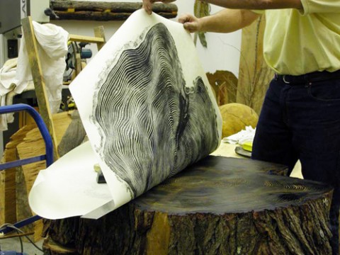
Bryan Nash Gill is the artist behind these sweet relief prints, but he's got a really cool blog too. If you are like me, you are always looking for web design inspiration (heck any inspiration will do), but if you are interested you should check it out.
Bryan Nash Gill is the artist behind these sweet relief prints, but he's got a really cool blog too. If you are like me, you are always looking for web design inspiration (heck any inspiration will do), but if you are interested you should check it out.
Critique: Week 11
This week has been busy as always.
I redesigned my school safety cover based on the critiques I received last week. I really loved my black cover, but what I loved about it was the directness that it got at the issue. I was told to work on the white cover with the repeated words, so I did my best to blend the two and came up with this:

I also worked on a sweet multimedia component for the books department. Next week, I'll post a link to Voxmagazine.com that will let you check it out.
Also, it has been another big week for our Meredith Project. The web site is really starting to come together and I am proud to have learned as much as I have (with the help of some other talented designers). Here are some more tidbits:


Response: Trend Assignment
What a worthwhile assignment we had this week. By forcing us to make a contact in the field and getting first hand advice, we all have to feel good about the direction our careers are headed. I was very happy to reconnect with Maggie Meyer and hear from a former Advanced Design student how our class translates to the real world (because it does). Thank goodness for content driven design!
You Can't Miss: American Character

As a morning person, I am an avid TODAY show watcher. This morning I saw something fascinating and inspiring that you guys simply can not miss.
Last year, USA Networks commissioned 11 photographers to participate in a project celebrating the diversity of our country and the "resilience of the American spirit." This morning, Natalie Morales interviewed two of the photographers involved. The photographs have been put together in a book: "American Character: A Photographic Journey" and they are fantastic.
Thanks to Hulu, you too can watch the interview. I think it's really interesting to hear what these two have to say about the people they photographed and their involvement in the project.
And here you can check out the photos!
Wednesday, April 08, 2009
DesignVerb: MINI Chameleon
How do they come up with these things?

This week, DesignVerb shows the latest and greatest invention in the auto industry: color-changing cars! The colors change according to weather conditions (the paint gets brighter on rainy days to improve visibility and lightens on sunny days to cool the vehicle down), which is not only amazing, but actually pretty practical as well. Unfortunately, the MINI Chameleon is only coming out in Singapore in June. Alas, we'll just have to stick with our boring singular color cars.
This week, DesignVerb shows the latest and greatest invention in the auto industry: color-changing cars! The colors change according to weather conditions (the paint gets brighter on rainy days to improve visibility and lightens on sunny days to cool the vehicle down), which is not only amazing, but actually pretty practical as well. Unfortunately, the MINI Chameleon is only coming out in Singapore in June. Alas, we'll just have to stick with our boring singular color cars.
You Can't Miss: Me on Twitter!
I'm on Twitter. My sister peer pressured me.
Except, I kinda love it!
Okay, I was really protesting this whole Twitter phenomenon, but then my family got on. For any of you who know how insanely close my family is, you understand how FOMO (Fear of Missing Out) can get the best of us. We've been through a lot in the last few years and now we just can't seem to get enough of each other (and we are scattered throughout the country so we have to rely on technology to keep in touch).
So my name is Kristin_Noe and I am currently looking for interesting designers to follow. Anybody follow anyone cool?
Tuesday, April 07, 2009
Response: Color Hunt
I thought the video Jan showed in class today was absolutely fascinating! I love watching people with so much passion for what they do and those people were obviously going to great lengths for their craft, which is inspiring.
It also made me think about a conversation I had with Jan after class today where I told her that I didn't think my work this semester was up to my creative standards. I just don't think I have the time that I want to execute all the projects that we had. She assured me that that is just the way creative people think, and I know that, I know my standards will probably always be higher than I am able to achieve, but if I had the time that those people do to research and really let an idea develop then my designing would be really awesome. But those guys probably think they don't have enough time either...
It also made me think about a conversation I had with Jan after class today where I told her that I didn't think my work this semester was up to my creative standards. I just don't think I have the time that I want to execute all the projects that we had. She assured me that that is just the way creative people think, and I know that, I know my standards will probably always be higher than I am able to achieve, but if I had the time that those people do to research and really let an idea develop then my designing would be really awesome. But those guys probably think they don't have enough time either...
Critique: Week 10
Last week was tough. And I barely made it out alive.
This week, I designed covers for Vox. After being given the choice to design a cover for Earth Day or the school safety feature, I chose the feature. I think the story is significant and deserves the prominence of being featured on the cover. So, I designed three serious covers that asked the question: How safe are Columbia's kids? I think that school safety really is a community-wide issue, which is why I chose to pose a question on the cover.


The critique was that they were too Sept. 11th. I didn't really know what that meant, so I googled "Sept. 11 Covers". I guess the middle one could look like the New Yorker cover with the Twin Towers on the black cover? Embarrassingly, I didn't know that cover existed. I just thought to myself, well this is different than anything Vox has done this semester, and it gets across the severity and gravity of the issue. Oh well, I am working on white one. I know we have already had typographic covers, so I'll have to come up with a little more for this one.
I have also been working on our Meredith project like crazy. I am doing a lot of redesigning and tweaking now that we have all the content. I am convinced that the end product is going to be just beautiful and am excited about where everything is going! Check out this other new element:

Wednesday, April 01, 2009
DesignVerb: Curiosity
This week, DesignVerb! reminded me that if you don't try, you'll never know.
Curiosity from Si on Vimeo.
I think that at this point in the semester (and really at any point in life) we can all benefit from enabling our curiosity to get the better of us. Whether it is experimenting with web design, portfolios or Vox covers, it is important to remember one of the most important characteristics that got us this far: our curiosity and willingness to experiment and put our wildest dreams out there.
So go ahead. Curiosity may have killed the cat, but he (or she to avoid minus 10) had nine lives.
Critique: Week 9
Last week was Spring Break. However, for me, it would be appropriately titled "Spring Work on Design at my Parents' House Week."
After a minor life crisis, I am the proud owner of a MacBook Pro (yes, you should be jealous). It is so fast and allows me to have all of CS4 open at once, so I can jump back and forth between programs. It has revolutionized my life.
I wish I had more to show for my week of hard work, but unfortunately it was a lot of trial and error. I am not ready to show the web site I have made to showcase my work, nor the Meredith Corporation prototype that I have been slaving over. But I will show some tidbits from it to whet your appetites:

After today's meetings, I have a lot of new ideas for the site. Despite much frustration, I have realized that I am very invested in this project and am excited about making it look really good.
After a minor life crisis, I am the proud owner of a MacBook Pro (yes, you should be jealous). It is so fast and allows me to have all of CS4 open at once, so I can jump back and forth between programs. It has revolutionized my life.
I wish I had more to show for my week of hard work, but unfortunately it was a lot of trial and error. I am not ready to show the web site I have made to showcase my work, nor the Meredith Corporation prototype that I have been slaving over. But I will show some tidbits from it to whet your appetites:


After today's meetings, I have a lot of new ideas for the site. Despite much frustration, I have realized that I am very invested in this project and am excited about making it look really good.
Response: Web site critique
It was very interesting for me to read my web site critiques from my fellow designers. I got mixed reviews on my design, which, ironically, reflects the way I actually feel about it. I'm not sure if I am totally sold on what I have done or if I completely hate it.
In a strange way, I feel like my web site needs to perfectly reflect my aesthetic. It is what I am using to encourage people to hire me after all. And I think I am putting too much pressure on myself in that regard. I am afraid to do too much because it won't be perfect.
I know I need to get over this quickly, but that is the current obstacle that I am battling. I think that I will be able to take the suggestions to build up the content while I am developing the overall look of the site. So, thanks for participating fellow designers!
You Can't Miss: Society of Illustrators
I came across this interesting post on The Cut today. It highlighted the Society of Illustrators new exhibition "In the Line of Fashion."
"The exhibit features fashion illustrations when they were at their peak in the forties and fifties — as well as notable sketches from as recently as this year — all focusing on illustration as a means to communicate fashion."
I think it is interesting to see the evolution of illustration in these sketches, as well as the different trends and styles that have floated in and out of the fashion world. Illustration is not my strongest design skill, but definitely my most improved this year. I have found that it can often be the best way to illustrate EXACTLY what you want, especially when there often isn't a photo to capture our wildest imaginations. Enjoy!
Wednesday, March 18, 2009
DesignVerb: Soap Leaves
DesignVerb is always bringing my attention to the coolest examples of design innovation in everyday life and today is no exception. Today I found the most beautiful and dainty leaves made from soap, which you would never have guessed by looking at them.

I'm just shocked by how real they look. I wonder what they look like after you use them, or if they dry your hands out. Maybe something this beautiful was only meant to be looked at? But then, why make leaves out of soap?
I'm just shocked by how real they look. I wonder what they look like after you use them, or if they dry your hands out. Maybe something this beautiful was only meant to be looked at? But then, why make leaves out of soap?
Response: Bringhurst
So, this week we were asked to read The Elements of Typographic Style by Robert Bringhurst, and I gotta say, it's overwhelming. I already consider my use of typography to be my greatest weakness in designing and reading about the minute details that go into the formation of every letter didn't calm my fears that I know nothing about type.
I do think that taking the time to get all the way through the book would be a good investment in my future, so I will power on, but I'll admit that Confessions of a Shopaholic, which is currently on my nightstand, is a lot more inviting.
I do think that taking the time to get all the way through the book would be a good investment in my future, so I will power on, but I'll admit that Confessions of a Shopaholic, which is currently on my nightstand, is a lot more inviting.
You Can't Miss: What has Vogue done to Adele's figure?
Women's magazines, why do you do this to us?
The Cut brought to my attention this photo of singer-songwriter Adele from Vogue.

Adele is a great singer who happens to be beautifully curvaceous, which you wouldn't know from this photo. Her positioning, clothing, the lighting and the undeniable use of photo shop have transformed Adele's body. What I'm still unsure about is where to place the blame? The stylists, art directors, photographers?
What makes matters worse is the dek featured under the photo: "At 20, the voluptuous, Grammy-winning singer-songwriter Adele translates her passion for soulful sixties divas into a captivating style. Hamish Bowles delights in her unvarnished truth."
Really, Vogue? Read their article here.
And for those of you who have never heard Adele, check out the song that made me fall in love with her:
The Cut brought to my attention this photo of singer-songwriter Adele from Vogue.
Adele is a great singer who happens to be beautifully curvaceous, which you wouldn't know from this photo. Her positioning, clothing, the lighting and the undeniable use of photo shop have transformed Adele's body. What I'm still unsure about is where to place the blame? The stylists, art directors, photographers?
What makes matters worse is the dek featured under the photo: "At 20, the voluptuous, Grammy-winning singer-songwriter Adele translates her passion for soulful sixties divas into a captivating style. Hamish Bowles delights in her unvarnished truth."
Really, Vogue? Read their article here.
And for those of you who have never heard Adele, check out the song that made me fall in love with her:
Critique: Week 8
This week has been all about Meredith (the project, not the TA).
With the help of Kirby and Jenn, I finally got my feet wet in Dreamweaver. It took a couple hours, but they showed me the ins and outs, and I am now confident inputting content on my own! I am starting to get really excited about the way our final project is turning out!
Unfortunately, I can't show all the hard work I have done at this point. Someday the world will see...
Oh, I also applied for another job this week: an art internship with National Geographic (what can I say, I aim high).
Sunday, March 15, 2009
Voxman

Here is the promised link to the Books' department story "The Anatomy of a Superhero" with my illustration of Vox's own superhero, Voxman.
Unfortunately, the online version doesn't have the fun blurbs I wrote to accompany my illustration, but it does have a create-your-own-superhero web feature. So go and create a Voxman of your own based on my illustration (you do have to scroll down to the bottom of the page)!
Wednesday, March 11, 2009
DesignVerb: Green Design
I love sustainability in all forms (just ask my roommates who find my obsession with recycling slightly difficult to live with) and apparently so does DesignVerb!
They posted this article about Project Green Bottle, which makes plastic bottles with a chemical that will allow them to break down over time, thus being biodegradable. This is awesome because, as DesignVerb! points out, it factors in the reality that despite the ease of recycling plastic bottles they often end up in landfills. Way to go Project Green Bottle!
They posted this article about Project Green Bottle, which makes plastic bottles with a chemical that will allow them to break down over time, thus being biodegradable. This is awesome because, as DesignVerb! points out, it factors in the reality that despite the ease of recycling plastic bottles they often end up in landfills. Way to go Project Green Bottle!
Critique: Week 7
This week, I finished up my superhero illustration. It will be on the Books page of Vox tomorrow as a diagram, as well as online at Vox Magazine in a fun interactive way. Special thanks to Meredith who taught me how to execute a flash project like this one! I'll put up a link to that when it is posted on the web site, but I kind of want to keep people in suspense, so I'm not going to even put up what's in print (okay, I'll post it after Vox comes out tomorrow for those of you who aren't in Columbia).
I also worked on logo designs for a health and wellness program here at the University of Missouri. I really enjoyed this project because it was completely different from anything else we have been assigned this semester, and it forced us to examine our design process, which turned out to be very helpful for me. Here are my favorite concepts out of the 1o that I executed, but they will need to be reworked before the final submission:


I also worked on logo designs for a health and wellness program here at the University of Missouri. I really enjoyed this project because it was completely different from anything else we have been assigned this semester, and it forced us to examine our design process, which turned out to be very helpful for me. Here are my favorite concepts out of the 1o that I executed, but they will need to be reworked before the final submission:


You Can't Miss: Rhymes with Twee Cards
I think it is helpful for me to see all the places that my design education might take me (especially when jobs are so sparse). Here's an example of something that all of us are clever, and talented, enough to do with our design skills post graduation (even if its just for fun).
I saw this on Daily Candy, so thanks to Sarah for drawing my attention to this fun web site! I subscribe to both the "Everywhere" articles and the "Chicago" articles, but check out the other cities that they have for one to suit your fancy.
This morning, they featured the handmade cards of Rhymes with Twee. The designer is so funny and does things like put guitar picks on the front with a message that says "I'm glad I picked you."

If any of you send someecards, these are kind of the flesh and blood (or paper and glue) version of those snarky messages. Check out the full article here!
I saw this on Daily Candy, so thanks to Sarah for drawing my attention to this fun web site! I subscribe to both the "Everywhere" articles and the "Chicago" articles, but check out the other cities that they have for one to suit your fancy.
This morning, they featured the handmade cards of Rhymes with Twee. The designer is so funny and does things like put guitar picks on the front with a message that says "I'm glad I picked you."
If any of you send someecards, these are kind of the flesh and blood (or paper and glue) version of those snarky messages. Check out the full article here!
Tuesday, March 10, 2009
Response: 20/10 Assignment
I found today's discussion of our different processes for designing to be really interesting. I think it really helped me to talk about some of the things I do when designing to go forward in the most beneficial way, and at this point in the semester, we do have a way of doing things and some rituals that will get us into trouble if we don't take note of them.
I know that I over analyze my designs (like I said, I over analyze everything thanks to my father), and I don't know that I will ever stop. However, I think this assignment was a really good one for me because it allowed me to systematically go through my ups and downs when designing. It also showed me that behind one bad idea is a potentially really good one- that is, if I don't get stuck on the bad one.
After our discussion, I came home to read my email and found an ironically appropriate article in my daily email from The Cut. They featured an interview with fashion designer Alber Elbaz, who designs for Lanvin. He talks about personal struggles with his weight, but also his low self confidence, which causes him to think that everything he designs is bad. They wrote: "Despite the continuous outpouring of praise, he is a perfectionist who always thinks his work sucks, which it never does."

Lately, I have been thinking that everything that I design sucks too! But its comforting to know that even the most successful people have doubts about projects that are so close to their hearts. If nothing else, I will just have to design more because inevitably I will like something... right?
I know that I over analyze my designs (like I said, I over analyze everything thanks to my father), and I don't know that I will ever stop. However, I think this assignment was a really good one for me because it allowed me to systematically go through my ups and downs when designing. It also showed me that behind one bad idea is a potentially really good one- that is, if I don't get stuck on the bad one.
After our discussion, I came home to read my email and found an ironically appropriate article in my daily email from The Cut. They featured an interview with fashion designer Alber Elbaz, who designs for Lanvin. He talks about personal struggles with his weight, but also his low self confidence, which causes him to think that everything he designs is bad. They wrote: "Despite the continuous outpouring of praise, he is a perfectionist who always thinks his work sucks, which it never does."
Lately, I have been thinking that everything that I design sucks too! But its comforting to know that even the most successful people have doubts about projects that are so close to their hearts. If nothing else, I will just have to design more because inevitably I will like something... right?
Wednesday, March 04, 2009
DesignVerb: "Everything's amazing and nobody's happy"
DesignVerb featured some REALLY awesome things this week from the world of design. This, although not entirely design related, is probably one of the best things I have seen in a while. This guy makes some great points about how we should all stop complaining (and this after my last post where I complain about waiting in lines... oops).
It won't let me embed, so sorry this link will have to do. Oh, and did I mention it's a clip from Conan?? That should entice some of you...
http://www.designverb.com/2009/02/27/everythings-amazing-nobodys-happy/
It won't let me embed, so sorry this link will have to do. Oh, and did I mention it's a clip from Conan?? That should entice some of you...
http://www.designverb.com/2009/02/27/everythings-amazing-nobodys-happy/
Response: True/False
On Friday, I attended my first ever True/False film. It's crazy to think that I have lived in Columbia for four years now and never been (I guess in my defense I was out of the country last year at this time). The film itself was really cool, but the event, well let's just say there are some things I would do differently.
One of my major disappointments was the difficulty of getting tickets. I know a lot of us had no idea how to get tickets in the first place, which for me was a simply a lack of investigation, but I felt as though it was pretty complicated. I couldn't go stand at the Artisan in the middle of a Thursday, and I bet other people with full time jobs would have the same complaint. It seemed to me that you really had to be in the know, or know someone who is (which is how I ended up getting my ticket- thank you Sarah).
We ended up waiting in a line, to then wait in line for tickets, which seemed a little redundant to me. Oh well, I got one, so I probably shouldn't be complaining, but I couldn't help but think if it were a little easier, more people would come out and see the films. The point of the festival is for people in Columbia to have their eyes widened by these amazing documentaries, and I can't help but think that the people who can't get tickets, or don't know how are the ones that really NEED to see them and be exposed to something outside of the bubble of Columbia.
I know that I would have loved to have seen more films over the course of the weekend, but all the waiting and lining up really deterred me from checking out more. Well, that and the price, but that's a whole other post...
Tuesday, March 03, 2009
Critique: Week 6
This past week, I finalized my Global Journalist spread. I wasn't entirely happy with it because I didn't think it was my most creative work, but it is always nice to have work from different publications to show your ability to adapt to different styles. At the last minute, I ended up designing a second spread. It was pretty similar, but it put my mind at ease:


I also worked on and sent in an application for a internship with Southern Progress Corporation. I had an open interview with a representative from SPC when they came to campus last semester and fell in love with the opportunities their company had to offer. Ultimately, I applied for work in several different departments, but my heart is set on working in any of their art departments. I had to send in design samples, so I am glad to have had portfolio critiques last week in class. Thanks guys for offering your opinions just when I needed them!
This week, I have been working on a superhero illustration for Vox that will also be an interactive component online. I am really excited about this project because it will give me some experience working in flash and will definitely add another dimension to my portfolio. I will post it next week when it is complete.
Friday, February 27, 2009
You Can't Miss: Quick Sprouts
This design inspiration comes from my sister (not a designer), which just goes to show you that even the untrained eye can identify cool and creative design.
Quick Sprouts featured this post on business cards: 51 Business Cards That Will Make You Look Twice. For all of us budding designers, an outrageous business card might just be the ticket to catching a future employer's eye. So check it out and be inspired!
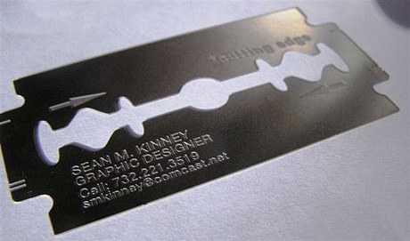

Quick Sprouts featured this post on business cards: 51 Business Cards That Will Make You Look Twice. For all of us budding designers, an outrageous business card might just be the ticket to catching a future employer's eye. So check it out and be inspired!
Wednesday, February 25, 2009
Response: Portfolio Critique
I found this week's portfolio critique to be a rude awakening. Seeing all my work spread out on the table like that, it looked like I had nothing to show for my years of design work. I guess I have designed in various different capacities and some of that work just isn't relevant, but it was hard to see that I didn't have much that I was really proud of.
I can't say that looking at others' work even helped that much either because so many of us want different things out of life.
I think that tomorrow when the second half of the class shows their work, I am going to try to write more detailed comments. Thanks to those who did that for me because that helped the most!
You Can't Miss: Congress Twittering
Although this is not exactly design related, it is worthy of note.
The Washington Post had this to say: "President Obama spoke of economic calamity and war last night in that solemn rite of democracy, the address to the joint session of Congress. And lawmakers watched him with the dignity Americans have come to expect of their leaders: They whipped out their BlackBerrys and began sending text messages like high school kids bored in math class."
Most of the Congress members were reported to be "twittering" as the President addressed the nation. I thought Twitter was a bit ridiculous before, and now I think the craze has just gotten way out of hand. I mean, I know there are people with poor cell phone etiquette, but when the President is speaking, put your phone away.
DesignVerb!
This week, DesignVerb! posted some notes from the Entrepreneurship Program Forum at Brown University. I hate to be another person talking about the economy, but I think it would be really interesting to have heard what these people had to say during a time like this. What do you guys think? Is there a place for entrepreneurs in an economy like this? Are they way to boost the economy back up?
Critique: Week 5
This week, I worked on designing a web site for our projects with the publishing class. Since I know next to nothing about web design (except the cool things that I see other people doing), it was difficult for me to imagine how all the elements I wanted to include would actually work. I ended up just putting together something that I thought looked visually appealing and fit the audience. The most interesting part of this experience was designing for a client, as opposed to making my aesthetic fit the assignment. Don't get me wrong, there are definitely aspects of me in the design, but I really tried to think about who would be using the site and making it work for them.
I also got my Global Journalist assignment this week and am about to go to a design meeting to see if it's okay. This was difficult because I unfamiliar with the publication. I had been told that it was pretty formatted, so I wanted to give them something that would fit in the magazine, but I also wanted it to be a good clip. Those of you who also had to design for GJ this week, how did your designs turn out? Did you keep with the strict formatting or do something completely original?
 The most interesting part of this experience was designing for a client, as opposed to making my aesthetic fit the assignment. Don't get me wrong, there are definitely aspects of me in the design, but I really tried to think about who would be using the site and making it work for them.
I also got my Global Journalist assignment this week and am about to go to a design meeting to see if it's okay. This was difficult because I unfamiliar with the publication. I had been told that it was pretty formatted, so I wanted to give them something that would fit in the magazine, but I also wanted it to be a good clip. Those of you who also had to design for GJ this week, how did your designs turn out? Did you keep with the strict formatting or do something completely original?
Tuesday, February 17, 2009
Response: Editing
Today in my editing class we critiqued the March issue of Outside magazine.
 I had never read Outside magazine before (let's face it, I'm not a man nor am I interested in adventure sports), which made the experience especially interesting. Not only did I find it easier to critique a magazine that I am in no way attached to, but I actually found myself considering aspects of the magazine industry that I don't usually consider in my classes or daily life.
From a design perspective, I gotta say, I didn't like it. The inconsistency and extraneous elements really got to me. Take the TOC for instance. The features pages has this AMAZINGLY striking photo of a bat, yet the next page for the departments was boring, boarding on cheesy. There would be absolutely beautiful full page (full-page?) photographs followed by crowded front of book sections. There's a lot of really cool stuff in the magazine, even for the non adventurous women like me, but without some more organization it will never really appeal to me.
What did you guys think?
I had never read Outside magazine before (let's face it, I'm not a man nor am I interested in adventure sports), which made the experience especially interesting. Not only did I find it easier to critique a magazine that I am in no way attached to, but I actually found myself considering aspects of the magazine industry that I don't usually consider in my classes or daily life.From a design perspective, I gotta say, I didn't like it. The inconsistency and extraneous elements really got to me. Take the TOC for instance. The features pages has this AMAZINGLY striking photo of a bat, yet the next page for the departments was boring, boarding on cheesy. There would be absolutely beautiful full page (full-page?) photographs followed by crowded front of book sections. There's a lot of really cool stuff in the magazine, even for the non adventurous women like me, but without some more organization it will never really appeal to me.
What did you guys think?
DesignVerb! Inspiration
With all the web design in my future, I am looking at DesignVerb! this week for some inspiration (especially since I know NOTHING about web design). This week, I noticed that their header changes every time the page reloads. It always follows the same format (photograph with very small blog title), but the photographs are so diverse that it looks like a completely new, inspired web site every time I log on! This is one of those things that I might
put in my bag of dirty little tricks, once I figure out how to execute it...


put in my bag of dirty little tricks, once I figure out how to execute it...


Critique: Week 4
This week I designed my first department page. The story was about digital readers and whether or not they signal the death of the printed word. My editors asked for a photo illustration, so I put together a gravestone for the printed word:
 Considering I am not a strong illustrator, I think it turned out pretty good. However, when I went to see how it printed out on Monday, there was a comment that it might not fit with the story :( At that moment, I realized just how important the headline and dek would be, especially since the original headlines were what spawned the idea in the first place. Every week I am learning more and more about how an entire staff really must work together to make a cohesive product.
Still to come this week: I am going to take my first stab at designing a web site and collect materials for my Global Journalist assignment. The world never stops spinning for a designer!
Saturday, February 14, 2009
You Can't Miss: Zac Posen's Optimism
Not a day goes by without hearing about the miserable economy, especially as a college senior looking for a job. However, I have decided to make a sincere effort to take note of those who can think positively during this difficult time. I think we could all use a little encouragement that all the hard work we are doing in our last (or one of our last) semesters as college students is not in vain. I give you fashion designer Zac Posen.
 When asked how the economic downturn was affecting his business he said: “It’s helped me to become more pure and determined in my vision. “It’s a more creative time.”
Posen started his line right after 9/11, another difficult time for the US economy. “Everyone was saying ‘don’t go into business, there’s no place, there’s no retail world out there.’ Nobody wanted to hear about a new brand. But you create your own excitement, and you create the industry, and you create the customer, and that’s what is going to get this country out of this difficult time.”
So chin up fellow designers (especially those of us looking for jobs)! Let's create our own excitement. If Zac can do it, we can too!
Special thanks to The Cut for alerting me to this.
When asked how the economic downturn was affecting his business he said: “It’s helped me to become more pure and determined in my vision. “It’s a more creative time.”Posen started his line right after 9/11, another difficult time for the US economy. “Everyone was saying ‘don’t go into business, there’s no place, there’s no retail world out there.’ Nobody wanted to hear about a new brand. But you create your own excitement, and you create the industry, and you create the customer, and that’s what is going to get this country out of this difficult time.”
So chin up fellow designers (especially those of us looking for jobs)! Let's create our own excitement. If Zac can do it, we can too!
Special thanks to The Cut for alerting me to this.
Wednesday, February 11, 2009
DesignVerb: Foam Furniture
I saw this article on DesignVerb last week and I've been thinking about it ever since.
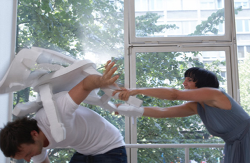 Some witty designer has made furniture that resembles that from old Western movies. The best part is, you can actually reenact the famous bar fights from the flicks because the furniture is made of foam! Finally we can all live out our fantasies of shattering a chair over our enemy's back.
Some witty designer has made furniture that resembles that from old Western movies. The best part is, you can actually reenact the famous bar fights from the flicks because the furniture is made of foam! Finally we can all live out our fantasies of shattering a chair over our enemy's back.You Can't Miss: Michelle Obama in Vogue

Thanks to my daily emails from New York Magazine's fashion section, The Cut, I got a heads up about the First Lady appearing on the cover of the March issue of Vogue.
A lot has been said about Michelle's (Don't you love that you feel like you are on a first name basis with the Obamas? I do.) style over the past year. On the campaign trail, she wore affordable clothing from brands like J.Crew and H & M. However, here she is gracing the cover of Vogue (only the second First Lady, after Hillary Clinton) and these bloggers seem to think she looks awkward and out of place.
I think she looks as beautiful as always and can't wait to read what is supposedly a lovely story inside, but what do others think?
Response: Alexey Brodovitch
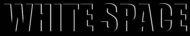
I have something in common with design great Alexey Brodovitch : a love of white space.
 My design aesthetic is extremely minimalistic with a great deal of white space (hence the title of my blog) and sometimes I think that my designs aren't as interesting because of this. I am trying to make my designs more complex, but I just find I am always drawn to the starkness of simple images and text against bright white.
I sometimes feel as though people interpret my aesthetic as lazy or uninspired, which is disappointing. However, now I've got Alexey as an ally- now how many people can say that?
Oh, and he likes dancers...
My design aesthetic is extremely minimalistic with a great deal of white space (hence the title of my blog) and sometimes I think that my designs aren't as interesting because of this. I am trying to make my designs more complex, but I just find I am always drawn to the starkness of simple images and text against bright white.I sometimes feel as though people interpret my aesthetic as lazy or uninspired, which is disappointing. However, now I've got Alexey as an ally- now how many people can say that?
Oh, and he likes dancers...
Critique: Week 3
This week, I have been working on the infamous love-themed photo essay for the February 12 issue of Vox.
To my disappointment, I am not happy with my end product. I really wish I had had more time to work with the photos, text and the concept as a whole. This was a really interesting project and I don't think justice was done.
I learned a lot about working with a team in this project, which I'm sure will be invaluable when I enter the "real world." It was extremely hard to merge the vision of so many people, and in trying to do so I never developed my own vision for the project, which was my downfall.
This will be one of those projects that I continue to work on for my portfolio, but also for myself. It will be very hard for me to see in print something that I am not completely satisfied with.
I also worked on covers for the February 19 issue:


After critique in lab last Thursday, I decided to continue working on the "Choose your own Adventure" cover. It was suggested that I modernize my original concept, so I came up with the idea of showing a travel book with post it notes, page tabs, etc. I couldn't find images that I liked online, so I set up exactly what I wanted and took pictures of it. I don't claim to be a brilliant photographer by any means, but if what you want isn't out there I guess you have to create it! Here is the redesign I am turning in tomorrow:

Next week: I'll be working on my first department page, updating my resume and a personal project for a children's camp that I volunteer at in the summer.
Subscribe to:
Comments (Atom)

