This entry was written by Matthew Edelstein, of the men's online fashion magazine The Contributing Editor. I decided to it out and found a really cool blog. Each of the entries are images with the actual story available only via a link underneath the art, which is a pretty cool concept that I haven't seen before.
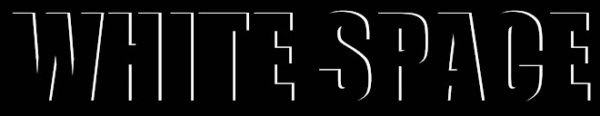
I found one entry that I thought was particularly stunning. Typography is my greatest weakness in designing, and I am always looking for inspiration/ideas in that area, which is probably why I was so drawn to this:
 So, if you are interested in men's fashion, design or typography, this site has a lot of offer. But don't take my word for it, see for yourself The Contributing Editor.


This is a neat example of typographic design. There are so many ways that the designer could have made this look really cheesy given the headline "Burning Inside," but I like the simple choices the designer made here. However, if I was the designer, I would not have done this on a black background, since it interferes with the legibility of the type.
ReplyDeleteWhile I am not a huge fashion fan, this is one of the best examples of combining photography, typography and color palettes that I have seen in a long time. There is a very dramatic them to the opening spread that I am sure gives the rest of a package a certain feel. I also really enjoyed the use of the red color accompanying the "Burning" headline. Great job!
ReplyDeleteKristin,
ReplyDeleteWhile I am not a huge fan of fashion design, this is one of the best combinations of photography, typography and color palette than I have seen. The combination of each of the elements really gives a sense of "burning." I don't really know what the rest of the article covers, but the opening spread is breathtaking.
I have to agree with you, typography is one of my down falls. When I come across designs that do it exceptionally well I am very impressed. This is a really good find.
ReplyDelete