Friday, February 27, 2009

You Can't Miss: Quick Sprouts

This design inspiration comes from my sister (not a designer), which just goes to show you that even the untrained eye can identify cool and creative design.

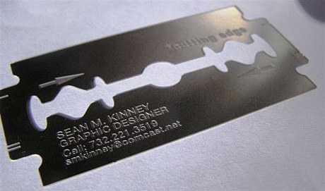
Quick Sprouts featured this post on business cards: 51 Business Cards That Will Make You Look Twice. For all of us budding designers, an outrageous business card might just be the ticket to catching a future employer's eye. So check it out and be inspired!

Link

Wednesday, February 25, 2009

Response: Portfolio Critique

I found this week's portfolio critique to be a rude awakening. Seeing all my work spread out on the table like that, it looked like I had nothing to show for my years of design work. I guess I have designed in various different capacities and some of that work just isn't relevant, but it was hard to see that I didn't have much that I was really proud of.

I can't say that looking at others' work even helped that much either because so many of us want different things out of life.

I think that tomorrow when the second half of the class shows their work, I am going to try to write more detailed comments. Thanks to those who did that for me because that helped the most!

You Can't Miss: Congress Twittering

Although this is not exactly design related, it is worthy of note.

The Washington Post had this to say: "President Obama spoke of economic calamity and war last night in that solemn rite of democracy, the address to the joint session of Congress. And lawmakers watched him with the dignity Americans have come to expect of their leaders: They whipped out their BlackBerrys and began sending text messages like high school kids bored in math class."

Most of the Congress members were reported to be "twittering" as the President addressed the nation. I thought Twitter was a bit ridiculous before, and now I think the craze has just gotten way out of hand. I mean, I know there are people with poor cell phone etiquette, but when the President is speaking, put your phone away.

DesignVerb!

This week, DesignVerb! posted some notes from the Entrepreneurship Program Forum at Brown University. I hate to be another person talking about the economy, but I think it would be really interesting to have heard what these people had to say during a time like this. What do you guys think? Is there a place for entrepreneurs in an economy like this? Are they way to boost the economy back up?

Critique: Week 5

This week, I worked on designing a web site for our projects with the publishing class. Since I know next to nothing about web design (except the cool things that I see other people doing), it was difficult for me to imagine how all the elements I wanted to include would actually work. I ended up just putting together something that I thought looked visually appealing and fit the audience.The most interesting part of this experience was designing for a client, as opposed to making my aesthetic fit the assignment. Don't get me wrong, there are definitely aspects of me in the design, but I really tried to think about who would be using the site and making it work for them.

I also got my Global Journalist assignment this week and am about to go to a design meeting to see if it's okay. This was difficult because I unfamiliar with the publication. I had been told that it was pretty formatted, so I wanted to give them something that would fit in the magazine, but I also wanted it to be a good clip. Those of you who also had to design for GJ this week, how did your designs turn out? Did you keep with the strict formatting or do something completely original?

Tuesday, February 17, 2009

Response: Editing

Today in my editing class we critiqued the March issue of Outside magazine.

I had never read Outside magazine before (let's face it, I'm not a man nor am I interested in adventure sports), which made the experience especially interesting. Not only did I find it easier to critique a magazine that I am in no way attached to, but I actually found myself considering aspects of the magazine industry that I don't usually consider in my classes or daily life.

From a design perspective, I gotta say, I didn't like it. The inconsistency and extraneous elements really got to me. Take the TOC for instance. The features pages has this AMAZINGLY striking photo of a bat, yet the next page for the departments was boring, boarding on cheesy. There would be absolutely beautiful full page (full-page?) photographs followed by crowded front of book sections. There's a lot of really cool stuff in the magazine, even for the non adventurous women like me, but without some more organization it will never really appeal to me.

What did you guys think?

DesignVerb! Inspiration

With all the web design in my future, I am looking at DesignVerb! this week for some inspiration (especially since I know NOTHING about web design). This week, I noticed that their header changes every time the page reloads. It always follows the same format (photograph with very small blog title), but the photographs are so diverse that it looks like a completely new, inspired web site every time I log on! This is one of those things that I might
put in my bag of dirty little tricks, once I figure out how to execute it...

Critique: Week 4

This week I designed my first department page. The story was about digital readers and whether or not they signal the death of the printed word. My editors asked for a photo illustration, so I put together a gravestone for the printed word:
Considering I am not a strong illustrator, I think it turned out pretty good. However, when I went to see how it printed out on Monday, there was a comment that it might not fit with the story :( At that moment, I realized just how important the headline and dek would be, especially since the original headlines were what spawned the idea in the first place. Every week I am learning more and more about how an entire staff really must work together to make a cohesive product.

Still to come this week: I am going to take my first stab at designing a web site and collect materials for my Global Journalist assignment. The world never stops spinning for a designer!

Saturday, February 14, 2009

You Can't Miss: Zac Posen's Optimism

Not a day goes by without hearing about the miserable economy, especially as a college senior looking for a job. However, I have decided to make a sincere effort to take note of those who can think positively during this difficult time. I think we could all use a little encouragement that all the hard work we are doing in our last (or one of our last) semesters as college students is not in vain. I give you fashion designer Zac Posen.
When asked how the economic downturn was affecting his business he said: “It’s helped me to become more pure and determined in my vision. “It’s a more creative time.”

Posen started his line right after 9/11, another difficult time for the US economy. “Everyone was saying ‘don’t go into business, there’s no place, there’s no retail world out there.’ Nobody wanted to hear about a new brand. But you create your own excitement, and you create the industry, and you create the customer, and that’s what is going to get this country out of this difficult time.”

So chin up fellow designers (especially those of us looking for jobs)! Let's create our own excitement. If Zac can do it, we can too!

Special thanks to The Cut for alerting me to this.

Wednesday, February 11, 2009

DesignVerb: Foam Furniture

I saw this article on DesignVerb last week and I've been thinking about it ever since.

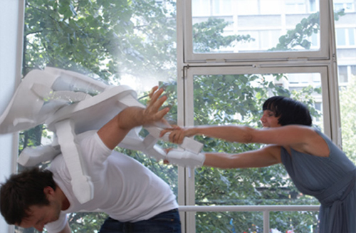
Some witty designer has made furniture that resembles that from old Western movies. The best part is, you can actually reenact the famous bar fights from the flicks because the furniture is made of foam! Finally we can all live out our fantasies of shattering a chair over our enemy's back.

You Can't Miss: Michelle Obama in Vogue


Thanks to my daily emails from New York Magazine's fashion section, The Cut, I got a heads up about the First Lady appearing on the cover of the March issue of Vogue.

A lot has been said about Michelle's (Don't you love that you feel like you are on a first name basis with the Obamas? I do.) style over the past year. On the campaign trail, she wore affordable clothing from brands like J.Crew and H & M. However, here she is gracing the cover of Vogue (only the second First Lady, after Hillary Clinton) and these bloggers seem to think she looks awkward and out of place.

I think she looks as beautiful as always and can't wait to read what is supposedly a lovely story inside, but what do others think?

Response: Alexey Brodovitch

I have something in common with design great Alexey Brodovitch : a love of white space.

My design aesthetic is extremely minimalistic with a great deal of white space (hence the title of my blog) and sometimes I think that my designs aren't as interesting because of this. I am trying to make my designs more complex, but I just find I am always drawn to the starkness of simple images and text against bright white.

I sometimes feel as though people interpret my aesthetic as lazy or uninspired, which is disappointing. However, now I've got Alexey as an ally- now how many people can say that?

Oh, and he likes dancers...

Critique: Week 3

This week, I have been working on the infamous love-themed photo essay for the February 12 issue of Vox.

To my disappointment, I am not happy with my end product. I really wish I had had more time to work with the photos, text and the concept as a whole. This was a really interesting project and I don't think justice was done.

I learned a lot about working with a team in this project, which I'm sure will be invaluable when I enter the "real world." It was extremely hard to merge the vision of so many people, and in trying to do so I never developed my own vision for the project, which was my downfall.

This will be one of those projects that I continue to work on for my portfolio, but also for myself. It will be very hard for me to see in print something that I am not completely satisfied with.

I also worked on covers for the February 19 issue:


After critique in lab last Thursday, I decided to continue working on the "Choose your own Adventure" cover. It was suggested that I modernize my original concept, so I came up with the idea of showing a travel book with post it notes, page tabs, etc. I couldn't find images that I liked online, so I set up exactly what I wanted and took pictures of it. I don't claim to be a brilliant photographer by any means, but if what you want isn't out there I guess you have to create it! Here is the redesign I am turning in tomorrow:


Next week: I'll be working on my first department page, updating my resume and a personal project for a children's camp that I volunteer at in the summer.
Wednesday, February 04, 2009

DesignVerb: More Sharks

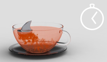
They're at it again. DesignVerb has found another awesome shark-inspired item.

This one is a tea bag holder that floats at the top of your mug, but what is really fun is the way that the color coming from your tea bag makes it look like a real shark attack has just taken place. Too cool.

You Can't Miss: Contributing Editor

The fashion enthusiast that I am subscribes to many websites, newsletters and blogs on the topic. This morning Who What Wear sent me an email about "Fashionable Fellows." Now I don't really follow men's fashion the way I do women's, but I find it interesting none the less to see what the fellas are wearing.

This entry was written by Matthew Edelstein, of the men's online fashion magazine The Contributing Editor. I decided to it out and found a really cool blog. Each of the entries are images with the actual story available only via a link underneath the art, which is a pretty cool concept that I haven't seen before.

I found one entry that I thought was particularly stunning. Typography is my greatest weakness in designing, and I am always looking for inspiration/ideas in that area, which is probably why I was so drawn to this:
So, if you are interested in men's fashion, design or typography, this site has a lot of offer. But don't take my word for it, see for yourself The Contributing Editor.

Response: Helvetica

Yesterday we watched Helvetica, a documentary about typography, and it was fascinating. I had no idea that people actually made entire careers out of designing type!

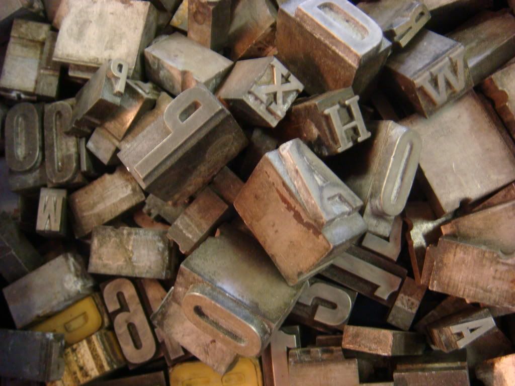
Last year when I was in London, Sarah and I went to Portobello Road to check out the markets. We spent a lot of time at the booth of a man with tons of letters similar to the ones in the beginning of the movie. I didn't give much thought to it then, but after seeing the movie yesterday, I tried to remember as much as I could about those little blocks. In hindsight, I wish I had bought some because not only are they an interesting reminder of the past, but they just look cool. Here's a photo to give you an idea...

Critique: Week 2

This week, I redesigned last week's feature "Profiles of the Economy," took one photograph a day and completed the shutter graffiti assignment (all photos below).

I continued to have a difficult time designing "Profiles" considering I had NO good ideas to begin with (and my whole family was watching the Super Bowl while I was trying to design). I ended up finding a cool image with fading dollar bills, which I thought fit the story pretty well, and the typography treatment is similar to something I saw in a magazine that I wanted to try. I added in some white space along the opposite page, which now that I look at it could have been a good place for a pull quote or economy fact. Oh well, there will always be other designs to try these things out on!

The photographic field notes assignment made me realize that I am not the brilliant photographer that I thought I was. While I was abroad, I took all these really great pictures of different things in Europe, so I assumed I was a good photographer. In reality, it is difficult to make a European adventure look bad. I now think that the mark of a good photographer is making the ordinary look good because THAT is hard (just look at my photos if you don't believe me). I did get some design ideas from my photos even if the lighting is bad.

I had an easier time with the Shutter Graffiti assignment than I thought I would. It's amazing that typography is everywhere. I think my favorite letter in the combination is the N, which came from an auditorium seat. Which letters do others like?

Tuesday, February 03, 2009

Shutter Graffiti

For this assignment, we really had to look to our surroundings.Here is my name composed of typography that I found in my everyday life.

Monday, February 02, 2009

Redesigns

After my cover was chosen from last week's competition, I worked with some of the more senior designers at Vox on turning it into a cover for the news stand. The experience was very educational, and hopefully will help me with cover assignments in the future. Here is the finished product:

After turning in a weak design for the assigned feature story, I have also redesigned that:This time, I found an interesting picture with dollar bills fading that I thought fit the current state of the economy, which is the basis for the story. After I finished, I realized the color was a lot like that on the cover I designed for Vox. I also managed to stick in some white space around the text to help it breathe. Now when I look back at my old design, I can't believe I didn't include any!

Photographic Field Notes 6

Sunday, February 01, 2009