Wednesday, April 29, 2009

Critique: Week 13

So close, yet so far away...

This week, I changed my focus from one web site project to another and worked like a dog to get a working web portfolio up. Unfortunately for me, figuring out how to host my own web site has proved to be more difficult than I ever thought it would be. I am now on my third redesign of the entire site and am finally starting to like where it is going. Once I figure out how to get it up on the web, I'll be a really happy camper.

My team and I have also been working on the Pets issue. I'm really happy with our style guide. It has just the right amount of fun elements to spice up our clean Vox layout. I haven't done anything else with the animal cruelty feature because I just got a second draft of the copy today. I think I may do the whole thing in black and white with navy accents to contrast the seriousness of the article with the rest of the magazine. Thoughts?

To get you all excited for the May 7th publication here is my baby, Wilke (or Wilk for short).


Oh, and she wears a Mizzou collar. How cute is that?

DesignVerb: Aaron Tang


After all this time I realized I didn't know ANYTHING about the blogger behind DesignVerb: Aaron Tang (I actually didn't even know his name five minutes ago). As it turns out, he's a really interesting designer with a background in industrial design (check out his resume) with a killer online portfolio. Since we have all been designing and redesigning (and redesigning) ours, I thought some inspiration might help. He uses roll overs too, which is proving to be a really effective way to give info on a web site.

Check him out!

Tuesday, April 28, 2009

You Can't Miss: Multicolr Search Lab


How cool is this? I came across a web site that allows you to search the "most interesting" photos on Flickr by color. The Multicolr Search Lab allows you to find photographs based on your color choices. And you can choose multiple colors and it will find photos that match them too! Check it out for yourself (I found the three photos above by choosing the color combination in my bedroom).

Wednesday, April 22, 2009

DesignVerb: and a lost robot

This may be the cutest thing I have seen in a long time... and wouldn't you know it, it's a very smart project. Watch. It's too cute not to.


Why you ask? Find out here.

Response: SSND Judging

This week, I attended the College News Design Contest hosted at the University of Missouri. It was really interesting because I had never experienced anything like that before, and I really enjoying comparing my peers' work to work from other universities. I regret not entering because I would have liked to have heard what the judges thought about my work, but the week that entries were due just wasn't my week (heck, this hasn't really been my semester). I know I'm a "loser" for not entering, but, lesson learned I will be sure to mark my calendar for next year when I have more clips worth entering.

If you're interested they kept a blog with audio from the judges, posting of the winnings, etc. Check it out here.

Critique: Week 12

We're getting near the end folks.

This past week I worked on our Meredith project like crazy so that it would be ready for galley edits on Monday, and boy, is it starting to look like a real web site. Today Jena and I joked that it looks "realer" with those ugly ads. Whatever it takes, I guess. Here are some new tidbits:


I also designed our "community" page, but it won't be a working web page, just a PDF to show.

In other news, there was Pet's work to be done both for my feature and and the entire issue. I can give away the good stuff just yet, but I am playing with the idea of chains for my feature (a story on animal cruelty). Here is a preliminary splash page:


I don't necessarily want it to be entirely black and white, but I kinda like where this is headed. The cramped lettering is supposed to mirror the tiny cages that the dogs in the story are stuffed into. I have only seen a first draft of the text, so I am sure my design will change with it.

You Can't Miss: Best and Worst Fashion Spreads

Today The Cut put together what they believe to be the Best and Worst Fashion Spreads from the April issues. They have some interesting categories including Best Hot Mess, Least Progressive Accessory, Best Male Model Wearing No Pants and Best Example of Why Lindsay Lohan Needs a Day Job.

There are also some legit categories too and some really interesting photography. So check it out, even if fashion journalism isn't your thing.

Wednesday, April 15, 2009

DesignVerb: Relief Prints

Check this out!


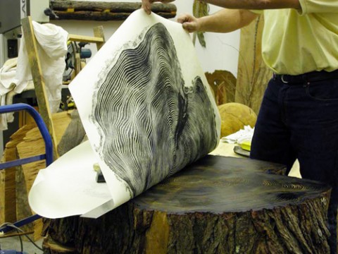
Bryan Nash Gill is the artist behind these sweet relief prints, but he's got a really cool blog too. If you are like me, you are always looking for web design inspiration (heck any inspiration will do), but if you are interested you should check it out.

Critique: Week 11

This week has been busy as always.

I redesigned my school safety cover based on the critiques I received last week. I really loved my black cover, but what I loved about it was the directness that it got at the issue. I was told to work on the white cover with the repeated words, so I did my best to blend the two and came up with this:


I also worked on a sweet multimedia component for the books department. Next week, I'll post a link to Voxmagazine.com that will let you check it out.

Also, it has been another big week for our Meredith Project. The web site is really starting to come together and I am proud to have learned as much as I have (with the help of some other talented designers). Here are some more tidbits:


Response: Trend Assignment

What a worthwhile assignment we had this week. By forcing us to make a contact in the field and getting first hand advice, we all have to feel good about the direction our careers are headed. I was very happy to reconnect with Maggie Meyer and hear from a former Advanced Design student how our class translates to the real world (because it does). Thank goodness for content driven design!

You Can't Miss: American Character


As a morning person, I am an avid TODAY show watcher. This morning I saw something fascinating and inspiring that you guys simply can not miss.

Last year, USA Networks commissioned 11 photographers to participate in a project celebrating the diversity of our country and the "resilience of the American spirit." This morning, Natalie Morales interviewed two of the photographers involved. The photographs have been put together in a book: "American Character: A Photographic Journey" and they are fantastic.

Thanks to Hulu, you too can watch the interview. I think it's really interesting to hear what these two have to say about the people they photographed and their involvement in the project.


And here you can check out the photos!

Wednesday, April 08, 2009

DesignVerb: MINI Chameleon

How do they come up with these things?


This week, DesignVerb shows the latest and greatest invention in the auto industry: color-changing cars! The colors change according to weather conditions (the paint gets brighter on rainy days to improve visibility and lightens on sunny days to cool the vehicle down), which is not only amazing, but actually pretty practical as well. Unfortunately, the MINI Chameleon is only coming out in Singapore in June. Alas, we'll just have to stick with our boring singular color cars.

You Can't Miss: Me on Twitter!

I'm on Twitter. My sister peer pressured me.

Except, I kinda love it!

Okay, I was really protesting this whole Twitter phenomenon, but then my family got on. For any of you who know how insanely close my family is, you understand how FOMO (Fear of Missing Out) can get the best of us. We've been through a lot in the last few years and now we just can't seem to get enough of each other (and we are scattered throughout the country so we have to rely on technology to keep in touch).

So my name is Kristin_Noe and I am currently looking for interesting designers to follow. Anybody follow anyone cool?

Tuesday, April 07, 2009

Response: Color Hunt

I thought the video Jan showed in class today was absolutely fascinating! I love watching people with so much passion for what they do and those people were obviously going to great lengths for their craft, which is inspiring.

It also made me think about a conversation I had with Jan after class today where I told her that I didn't think my work this semester was up to my creative standards. I just don't think I have the time that I want to execute all the projects that we had. She assured me that that is just the way creative people think, and I know that, I know my standards will probably always be higher than I am able to achieve, but if I had the time that those people do to research and really let an idea develop then my designing would be really awesome. But those guys probably think they don't have enough time either...

Critique: Week 10

Last week was tough. And I barely made it out alive.

This week, I designed covers for Vox. After being given the choice to design a cover for Earth Day or the school safety feature, I chose the feature. I think the story is significant and deserves the prominence of being featured on the cover. So, I designed three serious covers that asked the question: How safe are Columbia's kids? I think that school safety really is a community-wide issue, which is why I chose to pose a question on the cover.


The critique was that they were too Sept. 11th. I didn't really know what that meant, so I googled "Sept. 11 Covers". I guess the middle one could look like the New Yorker cover with the Twin Towers on the black cover? Embarrassingly, I didn't know that cover existed. I just thought to myself, well this is different than anything Vox has done this semester, and it gets across the severity and gravity of the issue. Oh well, I am working on white one. I know we have already had typographic covers, so I'll have to come up with a little more for this one.

I have also been working on our Meredith project like crazy. I am doing a lot of redesigning and tweaking now that we have all the content. I am convinced that the end product is going to be just beautiful and am excited about where everything is going! Check out this other new element:

Wednesday, April 01, 2009

DesignVerb: Curiosity

This week, DesignVerb! reminded me that if you don't try, you'll never know.


Curiosity from Si on Vimeo.

I think that at this point in the semester (and really at any point in life) we can all benefit from enabling our curiosity to get the better of us. Whether it is experimenting with web design, portfolios or Vox covers, it is important to remember one of the most important characteristics that got us this far: our curiosity and willingness to experiment and put our wildest dreams out there.

So go ahead. Curiosity may have killed the cat, but he (or she to avoid minus 10) had nine lives.

Critique: Week 9

Last week was Spring Break. However, for me, it would be appropriately titled "Spring Work on Design at my Parents' House Week."

After a minor life crisis, I am the proud owner of a MacBook Pro (yes, you should be jealous). It is so fast and allows me to have all of CS4 open at once, so I can jump back and forth between programs. It has revolutionized my life.

I wish I had more to show for my week of hard work, but unfortunately it was a lot of trial and error. I am not ready to show the web site I have made to showcase my work, nor the Meredith Corporation prototype that I have been slaving over. But I will show some tidbits from it to whet your appetites:


After today's meetings, I have a lot of new ideas for the site. Despite much frustration, I have realized that I am very invested in this project and am excited about making it look really good.

Response: Web site critique

It was very interesting for me to read my web site critiques from my fellow designers. I got mixed reviews on my design, which, ironically, reflects the way I actually feel about it. I'm not sure if I am totally sold on what I have done or if I completely hate it.

In a strange way, I feel like my web site needs to perfectly reflect my aesthetic. It is what I am using to encourage people to hire me after all. And I think I am putting too much pressure on myself in that regard. I am afraid to do too much because it won't be perfect.

I know I need to get over this quickly, but that is the current obstacle that I am battling. I think that I will be able to take the suggestions to build up the content while I am developing the overall look of the site. So, thanks for participating fellow designers!

You Can't Miss: Society of Illustrators


I came across this interesting post on The Cut today. It highlighted the Society of Illustrators new exhibition "In the Line of Fashion."

"The exhibit features fashion illustrations when they were at their peak in the forties and fifties — as well as notable sketches from as recently as this year — all focusing on illustration as a means to communicate fashion."

I think it is interesting to see the evolution of illustration in these sketches, as well as the different trends and styles that have floated in and out of the fashion world. Illustration is not my strongest design skill, but definitely my most improved this year. I have found that it can often be the best way to illustrate EXACTLY what you want, especially when there often isn't a photo to capture our wildest imaginations. Enjoy!