
I found this week's portfolio critique to be a rude awakening. Seeing all my work spread out on the table like that, it looked like I had nothing to show for my years of design work. I guess I have designed in various different capacities and some of that work just isn't relevant, but it was hard to see that I didn't have much that I was really proud of.
I can't say that looking at others' work even helped that much either because so many of us want different things out of life.
I think that tomorrow when the second half of the class shows their work, I am going to try to write more detailed comments. Thanks to those who did that for me because that helped the most!
Wednesday, February 25, 2009

You Can't Miss: Congress Twittering
Although this is not exactly design related, it is worthy of note.
The Washington Post had this to say: "President Obama spoke of economic calamity and war last night in that solemn rite of democracy, the address to the joint session of Congress. And lawmakers watched him with the dignity Americans have come to expect of their leaders: They whipped out their BlackBerrys and began sending text messages like high school kids bored in math class."
Most of the Congress members were reported to be "twittering" as the President addressed the nation. I thought Twitter was a bit ridiculous before, and now I think the craze has just gotten way out of hand. I mean, I know there are people with poor cell phone etiquette, but when the President is speaking, put your phone away.
The Washington Post had this to say: "President Obama spoke of economic calamity and war last night in that solemn rite of democracy, the address to the joint session of Congress. And lawmakers watched him with the dignity Americans have come to expect of their leaders: They whipped out their BlackBerrys and began sending text messages like high school kids bored in math class."
Most of the Congress members were reported to be "twittering" as the President addressed the nation. I thought Twitter was a bit ridiculous before, and now I think the craze has just gotten way out of hand. I mean, I know there are people with poor cell phone etiquette, but when the President is speaking, put your phone away.
DesignVerb!
This week, DesignVerb! posted some notes from the Entrepreneurship Program Forum at Brown University. I hate to be another person talking about the economy, but I think it would be really interesting to have heard what these people had to say during a time like this. What do you guys think? Is there a place for entrepreneurs in an economy like this? Are they way to boost the economy back up?
Critique: Week 5
This week, I worked on designing a web site for our projects with the publishing class. Since I know next to nothing about web design (except the cool things that I see other people doing), it was difficult for me to imagine how all the elements I wanted to include would actually work. I ended up just putting together something that I thought looked visually appealing and fit the audience. The most interesting part of this experience was designing for a client, as opposed to making my aesthetic fit the assignment. Don't get me wrong, there are definitely aspects of me in the design, but I really tried to think about who would be using the site and making it work for them.
I also got my Global Journalist assignment this week and am about to go to a design meeting to see if it's okay. This was difficult because I unfamiliar with the publication. I had been told that it was pretty formatted, so I wanted to give them something that would fit in the magazine, but I also wanted it to be a good clip. Those of you who also had to design for GJ this week, how did your designs turn out? Did you keep with the strict formatting or do something completely original?
 The most interesting part of this experience was designing for a client, as opposed to making my aesthetic fit the assignment. Don't get me wrong, there are definitely aspects of me in the design, but I really tried to think about who would be using the site and making it work for them.
I also got my Global Journalist assignment this week and am about to go to a design meeting to see if it's okay. This was difficult because I unfamiliar with the publication. I had been told that it was pretty formatted, so I wanted to give them something that would fit in the magazine, but I also wanted it to be a good clip. Those of you who also had to design for GJ this week, how did your designs turn out? Did you keep with the strict formatting or do something completely original?
Tuesday, February 17, 2009
Response: Editing
Today in my editing class we critiqued the March issue of Outside magazine.
 I had never read Outside magazine before (let's face it, I'm not a man nor am I interested in adventure sports), which made the experience especially interesting. Not only did I find it easier to critique a magazine that I am in no way attached to, but I actually found myself considering aspects of the magazine industry that I don't usually consider in my classes or daily life.
From a design perspective, I gotta say, I didn't like it. The inconsistency and extraneous elements really got to me. Take the TOC for instance. The features pages has this AMAZINGLY striking photo of a bat, yet the next page for the departments was boring, boarding on cheesy. There would be absolutely beautiful full page (full-page?) photographs followed by crowded front of book sections. There's a lot of really cool stuff in the magazine, even for the non adventurous women like me, but without some more organization it will never really appeal to me.
What did you guys think?
 I had never read Outside magazine before (let's face it, I'm not a man nor am I interested in adventure sports), which made the experience especially interesting. Not only did I find it easier to critique a magazine that I am in no way attached to, but I actually found myself considering aspects of the magazine industry that I don't usually consider in my classes or daily life.
From a design perspective, I gotta say, I didn't like it. The inconsistency and extraneous elements really got to me. Take the TOC for instance. The features pages has this AMAZINGLY striking photo of a bat, yet the next page for the departments was boring, boarding on cheesy. There would be absolutely beautiful full page (full-page?) photographs followed by crowded front of book sections. There's a lot of really cool stuff in the magazine, even for the non adventurous women like me, but without some more organization it will never really appeal to me.
What did you guys think?
DesignVerb! Inspiration
With all the web design in my future, I am looking at DesignVerb! this week for some inspiration (especially since I know NOTHING about web design). This week, I noticed that their header changes every time the page reloads. It always follows the same format (photograph with very small blog title), but the photographs are so diverse that it looks like a completely new, inspired web site every time I log on! This is one of those things that I might
put in my bag of dirty little tricks, once I figure out how to execute it...


put in my bag of dirty little tricks, once I figure out how to execute it...


Critique: Week 4
This week I designed my first department page. The story was about digital readers and whether or not they signal the death of the printed word. My editors asked for a photo illustration, so I put together a gravestone for the printed word:
 Considering I am not a strong illustrator, I think it turned out pretty good. However, when I went to see how it printed out on Monday, there was a comment that it might not fit with the story :( At that moment, I realized just how important the headline and dek would be, especially since the original headlines were what spawned the idea in the first place. Every week I am learning more and more about how an entire staff really must work together to make a cohesive product.
Still to come this week: I am going to take my first stab at designing a web site and collect materials for my Global Journalist assignment. The world never stops spinning for a designer!
 Considering I am not a strong illustrator, I think it turned out pretty good. However, when I went to see how it printed out on Monday, there was a comment that it might not fit with the story :( At that moment, I realized just how important the headline and dek would be, especially since the original headlines were what spawned the idea in the first place. Every week I am learning more and more about how an entire staff really must work together to make a cohesive product.
Still to come this week: I am going to take my first stab at designing a web site and collect materials for my Global Journalist assignment. The world never stops spinning for a designer!
Saturday, February 14, 2009
You Can't Miss: Zac Posen's Optimism
Not a day goes by without hearing about the miserable economy, especially as a college senior looking for a job. However, I have decided to make a sincere effort to take note of those who can think positively during this difficult time. I think we could all use a little encouragement that all the hard work we are doing in our last (or one of our last) semesters as college students is not in vain. I give you fashion designer Zac Posen.
 When asked how the economic downturn was affecting his business he said: “It’s helped me to become more pure and determined in my vision. “It’s a more creative time.”
Posen started his line right after 9/11, another difficult time for the US economy. “Everyone was saying ‘don’t go into business, there’s no place, there’s no retail world out there.’ Nobody wanted to hear about a new brand. But you create your own excitement, and you create the industry, and you create the customer, and that’s what is going to get this country out of this difficult time.”
So chin up fellow designers (especially those of us looking for jobs)! Let's create our own excitement. If Zac can do it, we can too!
Special thanks to The Cut for alerting me to this.
 When asked how the economic downturn was affecting his business he said: “It’s helped me to become more pure and determined in my vision. “It’s a more creative time.”
Posen started his line right after 9/11, another difficult time for the US economy. “Everyone was saying ‘don’t go into business, there’s no place, there’s no retail world out there.’ Nobody wanted to hear about a new brand. But you create your own excitement, and you create the industry, and you create the customer, and that’s what is going to get this country out of this difficult time.”
So chin up fellow designers (especially those of us looking for jobs)! Let's create our own excitement. If Zac can do it, we can too!
Special thanks to The Cut for alerting me to this.
Wednesday, February 11, 2009
DesignVerb: Foam Furniture
I saw this article on DesignVerb last week and I've been thinking about it ever since.
 Some witty designer has made furniture that resembles that from old Western movies. The best part is, you can actually reenact the famous bar fights from the flicks because the furniture is made of foam! Finally we can all live out our fantasies of shattering a chair over our enemy's back.
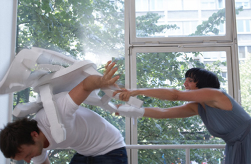 Some witty designer has made furniture that resembles that from old Western movies. The best part is, you can actually reenact the famous bar fights from the flicks because the furniture is made of foam! Finally we can all live out our fantasies of shattering a chair over our enemy's back.
You Can't Miss: Michelle Obama in Vogue

Thanks to my daily emails from New York Magazine's fashion section, The Cut, I got a heads up about the First Lady appearing on the cover of the March issue of Vogue.
A lot has been said about Michelle's (Don't you love that you feel like you are on a first name basis with the Obamas? I do.) style over the past year. On the campaign trail, she wore affordable clothing from brands like J.Crew and H & M. However, here she is gracing the cover of Vogue (only the second First Lady, after Hillary Clinton) and these bloggers seem to think she looks awkward and out of place.
I think she looks as beautiful as always and can't wait to read what is supposedly a lovely story inside, but what do others think?
Subscribe to:
Posts (Atom)


 Posts
Posts

