Watch this. I have no words. Oh except that it is genius to put your pants on without using your hands.
Wednesday, May 06, 2009
Response: Last Week of Classes
I can't believe it's here. The end.
Okay, so my family is ridiculously close, so of course they have seen my CountryHome.com prototype, all my Vox designs, my web site and now my mini portfolio even though they are all in Chicago. Today my dad sent me an email telling me how proud I should be of everything that I accomplished this year and how I exceeded all the expectations he had for my success at Mizzou (sweet, right?).
It made me feel really good, and I thought to myself: if everyone of my fellow Advanced Design students does have a person who will remind them of all they have accomplished, I will be that person. We should all be damn proud of making it through alive- hell, some of are coming out kicking and screaming. So, way to go us. Now, pat yourself on the back.
Critique: Week 14
This is it folks. My last week of undergrad. Wow.
Needless to say, I have been a designing fool this week. Finally got my web site up: KristinNoe.com. I'm pretty happy with it. It gives the exact tone that I wanted, I guess I just wish I had more really awesome, diverse work to put up.
After seeing how great Abbey's mini portfolio turned out, I used Blurb.com to make one also. I would have liked to have tried something handmade, but that just isn't in the cards for this time of the year. That being said, I really like how professional the Blurb books look. I can't wait to see it! Check out the preview here.
This past weekend I also got to art direct a photo shoot for the Books department of Vox. We were only shooting books, but I got to work with the photographer a lot, which was a very educational experience. He came up with some very interesting ways to arrange the books that made them look really beautiful. I guess that's why they pay him the... oh wait, no.
Oh, and the Pets issue comes out tomorrow! I was very happy with my feature on animal cruelty, but noticed in galley edits that some of my favorite parts of the spread were changed :( and I didn't save a copy of it, so I'll have to wait until tomorrow and get the pdf.
Sorry there is nothing visual to show for my week's work. Hopefully I'll pick up some interesting projects over the summer that I will be able to post!
Wednesday, April 29, 2009
Critique: Week 13
So close, yet so far away...
This week, I changed my focus from one web site project to another and worked like a dog to get a working web portfolio up. Unfortunately for me, figuring out how to host my own web site has proved to be more difficult than I ever thought it would be. I am now on my third redesign of the entire site and am finally starting to like where it is going. Once I figure out how to get it up on the web, I'll be a really happy camper.
My team and I have also been working on the Pets issue. I'm really happy with our style guide. It has just the right amount of fun elements to spice up our clean Vox layout. I haven't done anything else with the animal cruelty feature because I just got a second draft of the copy today. I think I may do the whole thing in black and white with navy accents to contrast the seriousness of the article with the rest of the magazine. Thoughts?
To get you all excited for the May 7th publication here is my baby, Wilke (or Wilk for short).

Oh, and she wears a Mizzou collar. How cute is that?

DesignVerb: Aaron Tang
After all this time I realized I didn't know ANYTHING about the blogger behind DesignVerb: Aaron Tang (I actually didn't even know his name five minutes ago). As it turns out, he's a really interesting designer with a background in industrial design (check out his resume) with a killer online portfolio. Since we have all been designing and redesigning (and redesigning) ours, I thought some inspiration might help. He uses roll overs too, which is proving to be a really effective way to give info on a web site.
Check him out!
Tuesday, April 28, 2009
You Can't Miss: Multicolr Search Lab


How cool is this? I came across a web site that allows you to search the "most interesting" photos on Flickr by color. The Multicolr Search Lab allows you to find photographs based on your color choices. And you can choose multiple colors and it will find photos that match them too! Check it out for yourself (I found the three photos above by choosing the color combination in my bedroom).
Wednesday, April 22, 2009
DesignVerb: and a lost robot
This may be the cutest thing I have seen in a long time... and wouldn't you know it, it's a very smart project. Watch. It's too cute not to.
Why you ask? Find out here.
Why you ask? Find out here.
Response: SSND Judging
This week, I attended the College News Design Contest hosted at the University of Missouri. It was really interesting because I had never experienced anything like that before, and I really enjoying comparing my peers' work to work from other universities. I regret not entering because I would have liked to have heard what the judges thought about my work, but the week that entries were due just wasn't my week (heck, this hasn't really been my semester). I know I'm a "loser" for not entering, but, lesson learned I will be sure to mark my calendar for next year when I have more clips worth entering.
If you're interested they kept a blog with audio from the judges, posting of the winnings, etc. Check it out here.
If you're interested they kept a blog with audio from the judges, posting of the winnings, etc. Check it out here.
Critique: Week 12
We're getting near the end folks.
This past week I worked on our Meredith project like crazy so that it would be ready for galley edits on Monday, and boy, is it starting to look like a real web site. Today Jena and I joked that it looks "realer" with those ugly ads. Whatever it takes, I guess. Here are some new tidbits:


I also designed our "community" page, but it won't be a working web page, just a PDF to show.
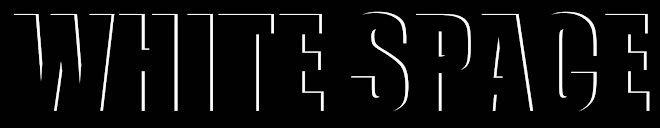
In other news, there was Pet's work to be done both for my feature and and the entire issue. I can give away the good stuff just yet, but I am playing with the idea of chains for my feature (a story on animal cruelty). Here is a preliminary splash page:

I don't necessarily want it to be entirely black and white, but I kinda like where this is headed. The cramped lettering is supposed to mirror the tiny cages that the dogs in the story are stuffed into. I have only seen a first draft of the text, so I am sure my design will change with it.
This past week I worked on our Meredith project like crazy so that it would be ready for galley edits on Monday, and boy, is it starting to look like a real web site. Today Jena and I joked that it looks "realer" with those ugly ads. Whatever it takes, I guess. Here are some new tidbits:


I also designed our "community" page, but it won't be a working web page, just a PDF to show.
In other news, there was Pet's work to be done both for my feature and and the entire issue. I can give away the good stuff just yet, but I am playing with the idea of chains for my feature (a story on animal cruelty). Here is a preliminary splash page:

I don't necessarily want it to be entirely black and white, but I kinda like where this is headed. The cramped lettering is supposed to mirror the tiny cages that the dogs in the story are stuffed into. I have only seen a first draft of the text, so I am sure my design will change with it.
You Can't Miss: Best and Worst Fashion Spreads
Today The Cut put together what they believe to be the Best and Worst Fashion Spreads from the April issues. They have some interesting categories including Best Hot Mess, Least Progressive Accessory, Best Male Model Wearing No Pants and Best Example of Why Lindsay Lohan Needs a Day Job.
There are also some legit categories too and some really interesting photography. So check it out, even if fashion journalism isn't your thing.
There are also some legit categories too and some really interesting photography. So check it out, even if fashion journalism isn't your thing.
Subscribe to:
Posts (Atom)

