Wednesday, February 11, 2009

Response: Alexey Brodovitch

I have something in common with design great Alexey Brodovitch : a love of white space.

My design aesthetic is extremely minimalistic with a great deal of white space (hence the title of my blog) and sometimes I think that my designs aren't as interesting because of this. I am trying to make my designs more complex, but I just find I am always drawn to the starkness of simple images and text against bright white.

I sometimes feel as though people interpret my aesthetic as lazy or uninspired, which is disappointing. However, now I've got Alexey as an ally- now how many people can say that?

Oh, and he likes dancers...

Critique: Week 3

This week, I have been working on the infamous love-themed photo essay for the February 12 issue of Vox.

To my disappointment, I am not happy with my end product. I really wish I had had more time to work with the photos, text and the concept as a whole. This was a really interesting project and I don't think justice was done.

I learned a lot about working with a team in this project, which I'm sure will be invaluable when I enter the "real world." It was extremely hard to merge the vision of so many people, and in trying to do so I never developed my own vision for the project, which was my downfall.

This will be one of those projects that I continue to work on for my portfolio, but also for myself. It will be very hard for me to see in print something that I am not completely satisfied with.

I also worked on covers for the February 19 issue:


After critique in lab last Thursday, I decided to continue working on the "Choose your own Adventure" cover. It was suggested that I modernize my original concept, so I came up with the idea of showing a travel book with post it notes, page tabs, etc. I couldn't find images that I liked online, so I set up exactly what I wanted and took pictures of it. I don't claim to be a brilliant photographer by any means, but if what you want isn't out there I guess you have to create it! Here is the redesign I am turning in tomorrow:


Next week: I'll be working on my first department page, updating my resume and a personal project for a children's camp that I volunteer at in the summer.

Wednesday, February 04, 2009

DesignVerb: More Sharks

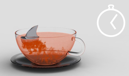
They're at it again. DesignVerb has found another awesome shark-inspired item.

This one is a tea bag holder that floats at the top of your mug, but what is really fun is the way that the color coming from your tea bag makes it look like a real shark attack has just taken place. Too cool.

You Can't Miss: Contributing Editor

The fashion enthusiast that I am subscribes to many websites, newsletters and blogs on the topic. This morning Who What Wear sent me an email about "Fashionable Fellows." Now I don't really follow men's fashion the way I do women's, but I find it interesting none the less to see what the fellas are wearing.

This entry was written by Matthew Edelstein, of the men's online fashion magazine The Contributing Editor. I decided to it out and found a really cool blog. Each of the entries are images with the actual story available only via a link underneath the art, which is a pretty cool concept that I haven't seen before.

I found one entry that I thought was particularly stunning. Typography is my greatest weakness in designing, and I am always looking for inspiration/ideas in that area, which is probably why I was so drawn to this:
So, if you are interested in men's fashion, design or typography, this site has a lot of offer. But don't take my word for it, see for yourself The Contributing Editor.

Response: Helvetica

Yesterday we watched Helvetica, a documentary about typography, and it was fascinating. I had no idea that people actually made entire careers out of designing type!

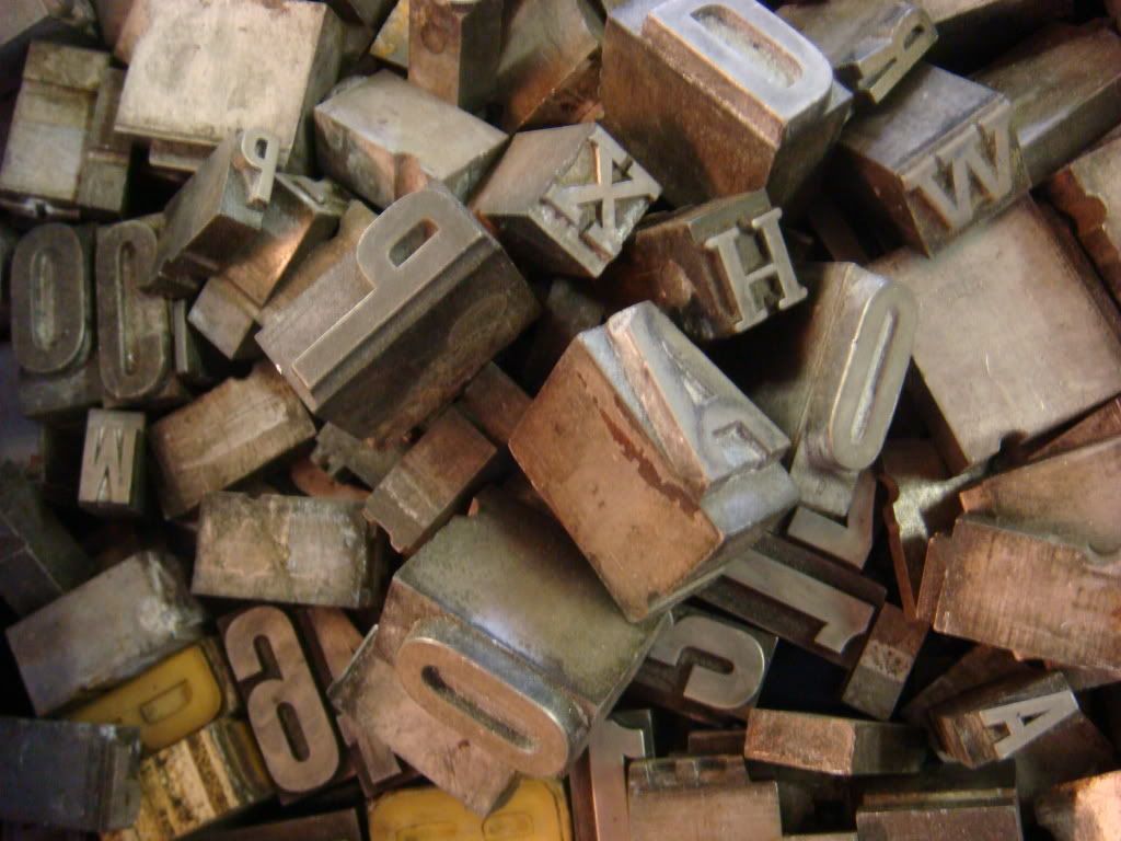
Last year when I was in London, Sarah and I went to Portobello Road to check out the markets. We spent a lot of time at the booth of a man with tons of letters similar to the ones in the beginning of the movie. I didn't give much thought to it then, but after seeing the movie yesterday, I tried to remember as much as I could about those little blocks. In hindsight, I wish I had bought some because not only are they an interesting reminder of the past, but they just look cool. Here's a photo to give you an idea...

Critique: Week 2

This week, I redesigned last week's feature "Profiles of the Economy," took one photograph a day and completed the shutter graffiti assignment (all photos below).

I continued to have a difficult time designing "Profiles" considering I had NO good ideas to begin with (and my whole family was watching the Super Bowl while I was trying to design). I ended up finding a cool image with fading dollar bills, which I thought fit the story pretty well, and the typography treatment is similar to something I saw in a magazine that I wanted to try. I added in some white space along the opposite page, which now that I look at it could have been a good place for a pull quote or economy fact. Oh well, there will always be other designs to try these things out on!

The photographic field notes assignment made me realize that I am not the brilliant photographer that I thought I was. While I was abroad, I took all these really great pictures of different things in Europe, so I assumed I was a good photographer. In reality, it is difficult to make a European adventure look bad. I now think that the mark of a good photographer is making the ordinary look good because THAT is hard (just look at my photos if you don't believe me). I did get some design ideas from my photos even if the lighting is bad.

I had an easier time with the Shutter Graffiti assignment than I thought I would. It's amazing that typography is everywhere. I think my favorite letter in the combination is the N, which came from an auditorium seat. Which letters do others like?

Tuesday, February 03, 2009

Shutter Graffiti

For this assignment, we really had to look to our surroundings.Here is my name composed of typography that I found in my everyday life.

Monday, February 02, 2009

Redesigns

After my cover was chosen from last week's competition, I worked with some of the more senior designers at Vox on turning it into a cover for the news stand. The experience was very educational, and hopefully will help me with cover assignments in the future. Here is the finished product:

After turning in a weak design for the assigned feature story, I have also redesigned that:This time, I found an interesting picture with dollar bills fading that I thought fit the current state of the economy, which is the basis for the story. After I finished, I realized the color was a lot like that on the cover I designed for Vox. I also managed to stick in some white space around the text to help it breathe. Now when I look back at my old design, I can't believe I didn't include any!

Photographic Field Notes 6

Sunday, February 01, 2009