Saturday, January 31, 2009

Photographic Field Notes 4


(Hopefully halfway through this assignment everyone is coming to the realization that I am not a brilliant photographer)
Photographic Field Notes 3

Friday, January 30, 2009

Wednesday, January 28, 2009

Photographic Field Notes 1

DesignVerb!

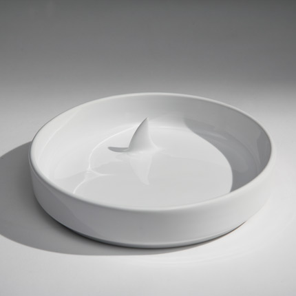
DesignVerb has recently found design sneaking into the most ordinary of items in the most extraordinary ways (but don't worry, they've got Obama footage too). This week, they focused on glasses and bowls with simple, yet interesting, details that increase the fun of a glass of water or bowl of cereal.
The bowl reminds me of a mug that my sisters and I had when we were young that had a cat at the bottom. As you drank, he would gradually appear and stare you down as you sipped your hot chocolate. After seeing this shark bowl, I can say with certainty that surprises in dishware are not just for kids.

You Can't Miss: The Winger

This week, The Winger had an interest post from the co-founder of SYREN Modern Dance Company about the group's program "Dance on Canvas." Basically they hold rehearsals rehearsals at The Art Students League in Manhattan, and students are invited to draw, paint, sketch and photograph while they dance.

I think this is awesome because it combines two of my great loves (dance and art/design), but I think it is also relevant to our discussions about inspiration and ways to get ideas for our own designs. So, check it out: Rehearsing in an Art Gallery.

( The Winger is a favorite blog of mine. I could try to explain it, but they do a much better job themselves: The Winger is a collaborative website where professionals, students, experts and pioneers in the dance world share their experiences and insights. The Winger was created in an effort to help promote and popularize dance by connecting audiences to artists in a personal and meaningful way, while giving artists a voice of their own.)

Response: Editing Class

Yesterday in my Magazine Editing lecture, Professor Rowe talked about the ways in which the hierarchy of editors can vary from publication to publication. Sitting there, what she was saying seemed so obvious, yet I realized that I had never given the topic very much thought. She brought attention to the fact that at some magazines the design director is listed second or third, while at others he or she isn't listed until much farther down the masthead. She said if she were a designer, she would take this into consideration because it is a reflection of how important the magazine's design is to the publication as a whole.

Obvious, right? But honestly I had never thought about it. Sadly, I always assumed that designers (even the lead ones) were listed farther down on all mastheads, and that that was simply the way the industry worked. I assumed that editorial positions would always receive masthead superiority.

I am so glad that this unfortunate misconception on my part was cleared up as I start to look for jobs in design. Now, not only will I look at whether I like the design, but also how important the magazine deems my position to be as a part of the whole operation. Thanks Professor Rowe!

Tuesday, January 27, 2009

Beginning Assignment: Critique

This week, I designed a cover and a feature story as part of a "competition" for this week's issue of Vox, The Voice of Columbia.

My cover was chosen and will be published this Thursday, but it has come a long way from the draft that I initially entered (pictured below):The cover story is about the ways that unsigned artists market their own music, especially the recent increase of indie music being used on television shows. Since I know nothing about music or the music industry, I had no idea how to illustrate this story. I thought about how local bands cover Columbia with posters promoting upcoming shows and decided to use that as inspiration. In looking for photographs on stock.xchng, I saw some other images that provoked more ideas. I found a great photograph of a stack of CDs and considered the headline: Stacked Against the Competition. I never found an appropriate picture of a telephone pole or bulletin board covered with band posters. While I worked on the "Stacked" option, I couldn't shake the archaic idea of sending out demo tapes. So, I found an image of an old cassette tape and decided on the headline: Out with the Old.

While working on this assignment I learned two important things:
1. Searching for art can be the best way to drudge up an idea
2. You MUST use any and all keywords to find images on web sites like stock.xchng

The story of my feature design doesn't have as happy of an ending. I also drew a blank on how to illustrate this story about two men with very different roles, and viewpoints, on the current economy. I am not at all happy with what I finally came up, and although I would like to blame it on the limited number of pictures that is just simply not going to cut it as I get closer and closer to the real world. I guess I had a real problem coming up with ideas that I thought weren't cliché or obvious. I ended up using the two close-up shots of men in the story to satisfy the headline, and I tried to make the font look like that on a dollar bill. In the end, there just wasn't anything interesting or eye catching about it. Hopefully with a little more time I will be able to create something that I am proud of. Below is a picture of the first page of the spread (don't worry, you aren't missing anything on the second).


Coming up next: Tomorrow I start working on a love-themed photo essay, which will be the secondary feature in the Feb. 12 issue of Vox, as well as the shutter graffiti/photographic field notes assignment.